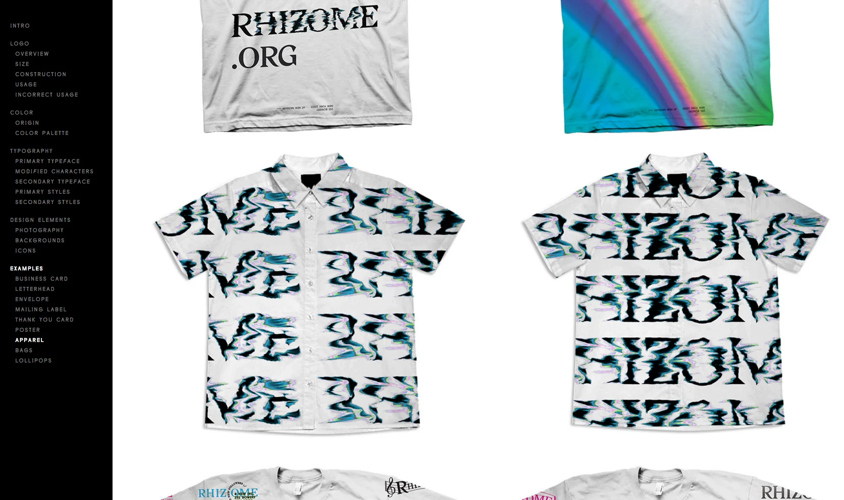
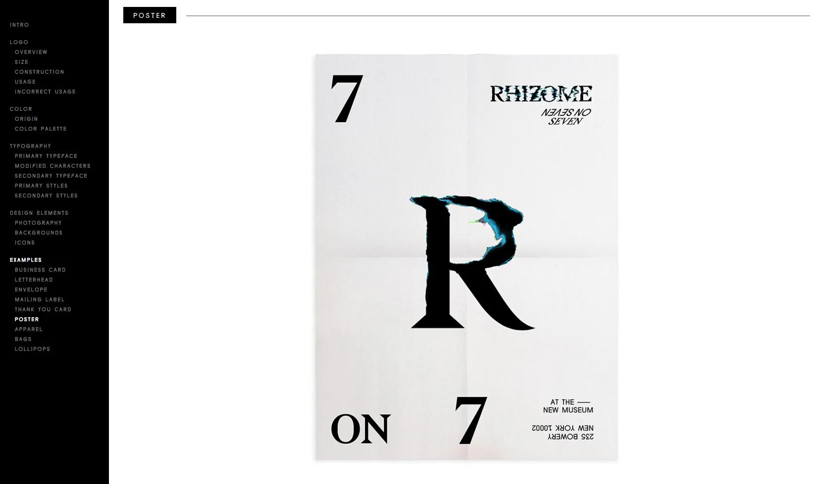
The art explorations focused on the aesthetics of color decay and erosion. While most of the art directions are defined with visual design programs like Photoshop and After Effects, the core element of the new brand identity — the Rhizome logo — was conceptualized as a living form, gradually eroded by the increasing number of home page visitors.
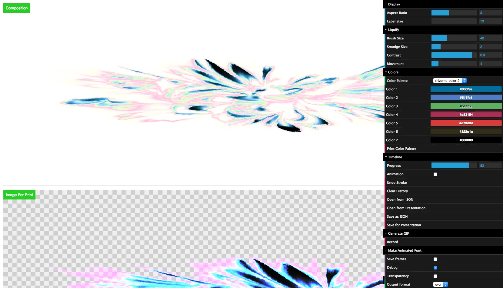
After understood how each version of the logo artwork was produced by visual designers, I self-conducted making an effect visualizer that could perform the decaying process through a creative-friendly user interface. From there, the peer designers started to manipulate pixels with the fun, Photoshop-like smudge-brush tool until reaching the look desired.
It goes without saying that this was a collaborative process involving multiple participants. Art directors and technologists alike were needed because of the sheer number of visual tweaks and the results of code experiments, which may or may not have worked.
The color editor provides some interesting options for the creatives.
Due to the complex nature of mixing effects from multiple canvas passes as well as the large resolution for quality printing, it became a processor-intensive task for the CPU to handle, and that slowed down design efficiency significantly. I resorted to splitting the heavy parts to Web Workers with signaled delays; therefore, the main thread was set free, and the editing interface remained responsive. (Additional credit goes to Craig Blagg, who ported a canvas API from FireFox that magically runs on the Web Workers.)
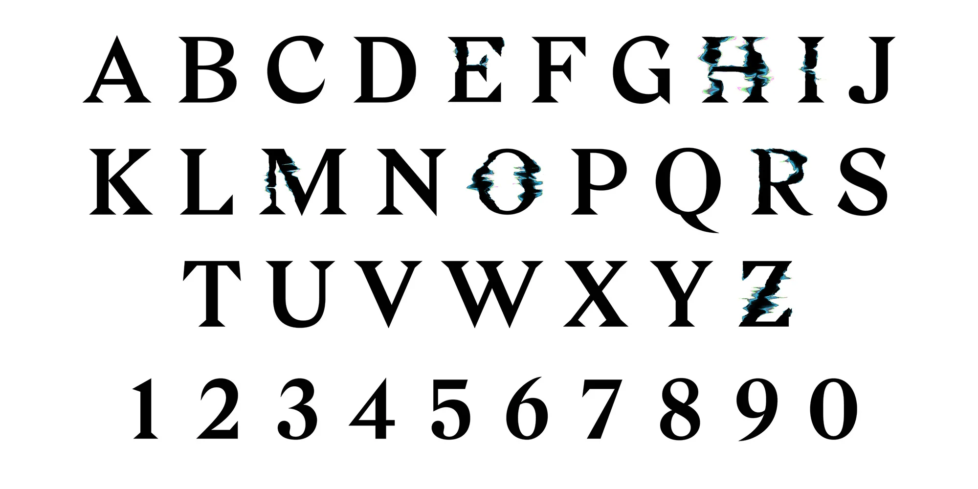
With enough power and productivity of the editing tool, it also easily enabled generating the entire family of visual symbols for the brand's visual identity.


